User Tools
Annual Valuation Chart
How to Read an Annual Valuation Chart
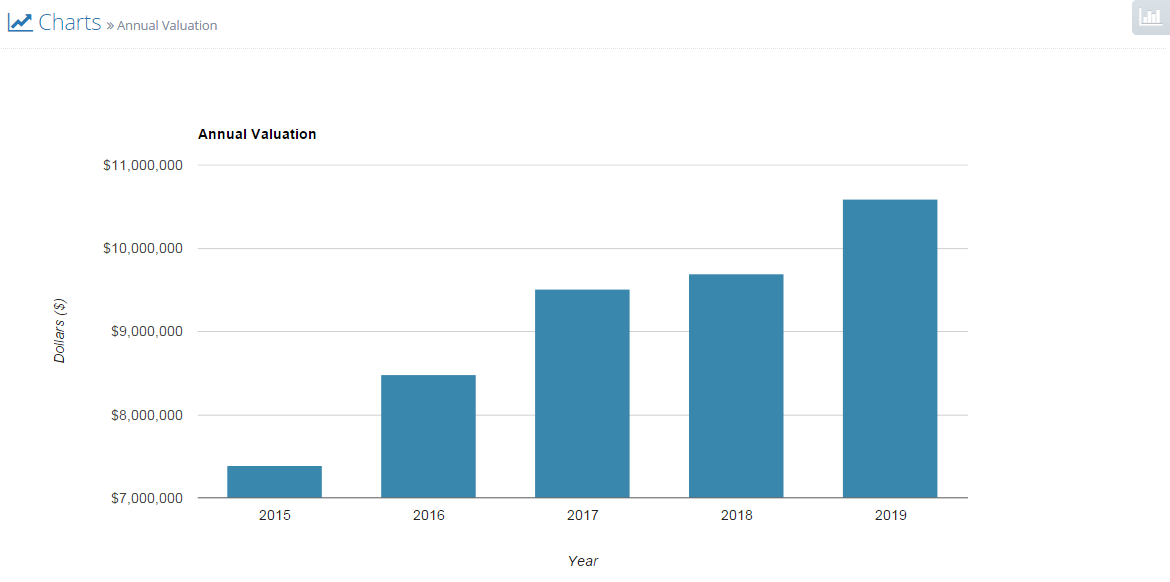
When you click on the report Valuation and IRR, we show you three tables. The top table describes how we determine the company's value at the time of the liquidity event (at a date that you specified in your assumptions). Specifically, Offtoa uses five valuation techniques (multiples of trailing revenues, gross profits, EBITDA, EBIT, and EAT, where the “multiple” used is a function of the specific industry) and averages their results. In the case of an acquisition, this is a prediction of how much a third party might pay to acquire the company, and thus is the amount available for distribution to shareholders. In the case of an IPO, this is a prediction of the market value of shares owned by shareholders. The annual valuation chart shown here answers the question “what would my company be worth if the liquidity event occurred earlier or later?” It uses the same multiples as appropriate for your industry, but it uses the trailing revenues, gross profits, EBITDA, EBIT, and EAT for each of the model years to do the valuation calculation and plots their averages. Thus, for year n, the point plotted is:
Average (
trailing revenues for year n x industry-specific multiple of revenues,
trailing gross profits for year n x industry-specific multiple of gross profits,
trailing EBITDA for year n x industry-specific multiple of EBITDA,
trailing EBIT for year n x industry-specific multiple of EBIT,
trailing EAT for year n x industry-specific multiple of EAT)
The point on this chart corresponding to the year of the liquidity event should show the same valuation as seen on your Valuation and IRR report.
Here is an example:

